Overview
Exploring the history and aesthetics of Bodoni.
Utilized knowledge with typesetting, layout, color, and motion graphics.
17X11" Magazine Spread
60 sec. Typography Motion Graphic Animation
Contributors: Individual Project
Duration: 4 weeks

17X11" Magazine Spread
Motion Graphic Animation
Learning the Typeface
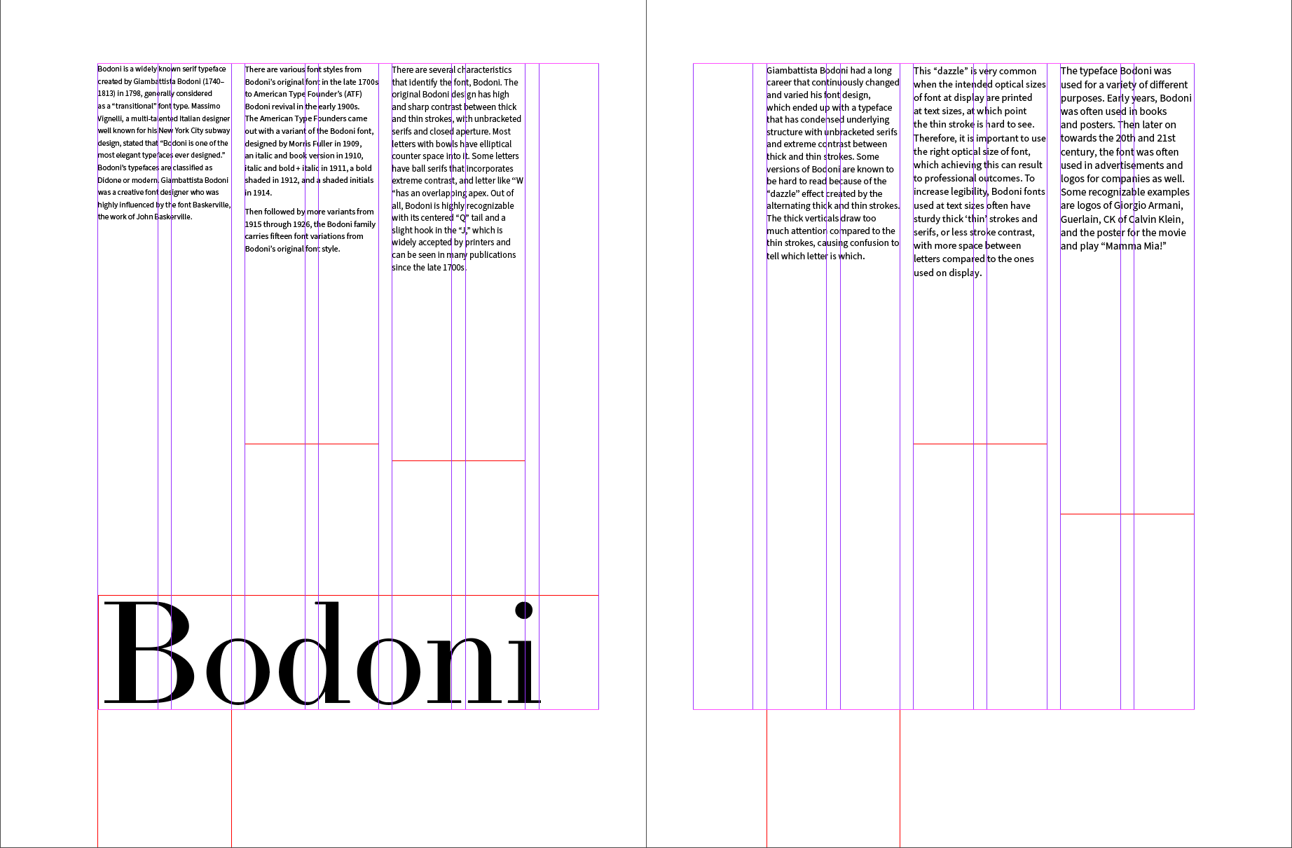
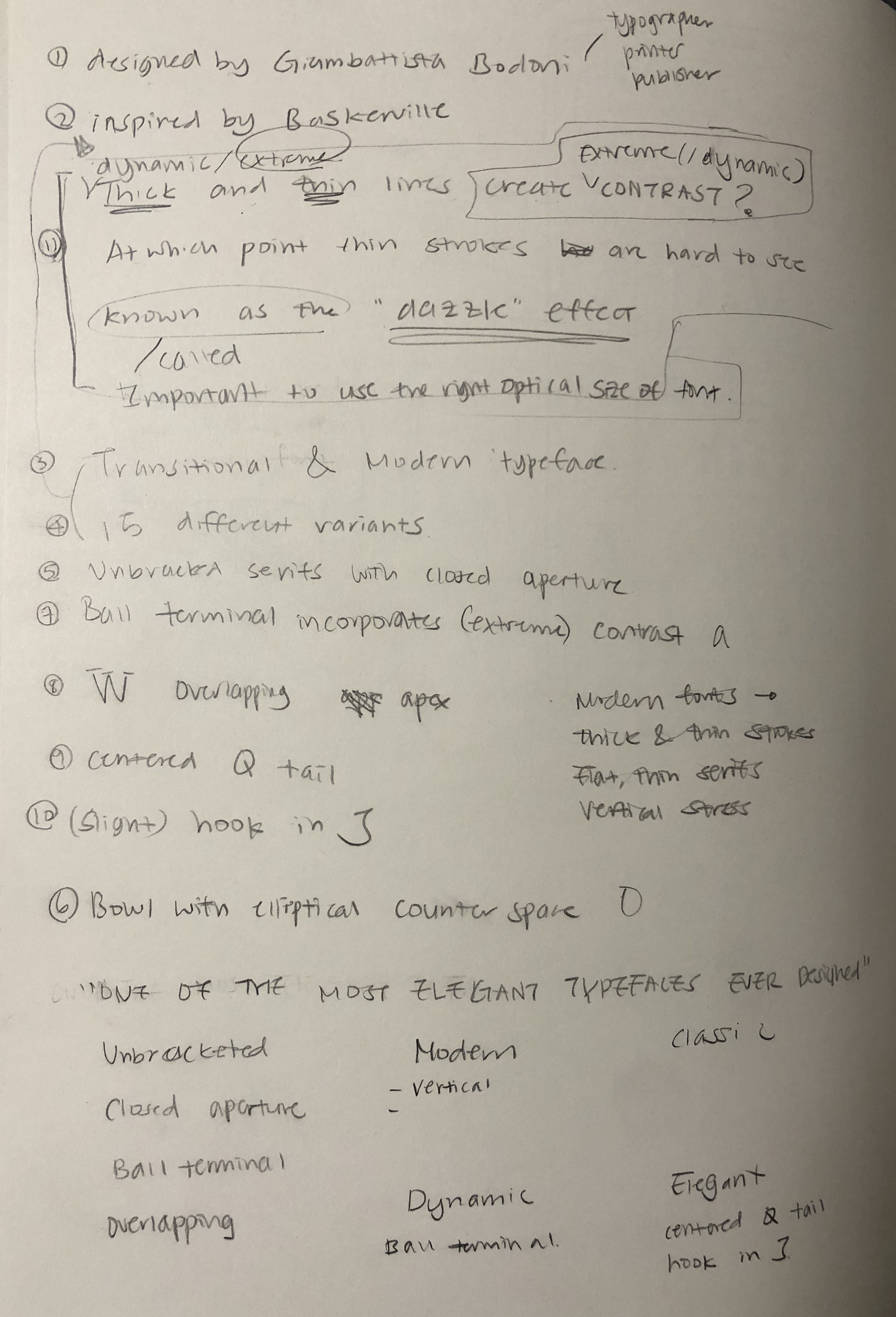
I began my exploration with writing a copy of the history and characteristics of Bodoni. I studied how Bodoni was designed, what kind Bodoni is, and when this type is frequently used to inform the audiences that this particular typeface is intertwined with classic and modernism. Understanding why this type is so different from other typefaces was my aim for this research. Some key takeaways from this research was that Bodoni was influenced by Baskerville, the work of John Baskerville. First designed in the late 1790s, the high and sharp contrast between thick and thin strokes with unbracketed serifs are the key characteristics that identify the typeface, Bodoni. This gathered research was written into a short essay, which then became the content used in the magazine spread.
Through this research process, I discovered that the type was created with deep history centuries ago, yet it was redesigned in the early 1900s enabling the font to be utilized in a present world. This led Bodoni to hold a sense of classic and modernism at the same time.
Understanding the Font
Bodoni is a typeface that has condensed underlying structure with unbracketed serifs and extreme contrast between thick and thin strokes. Some versions of Bodoni are known to be hard to read because of the “dazzle” effect created by the alternating thick and thin strokes. The thick and verticals draw too much attention compared to the thin strokes, which is common when the intended optical sizes displayed are printed at text sizes, at which point the thin strokes are hard to see. Therefore, I ended up choosing a sans serif font that went along well with Bodoni for the body texts in the magazine spread. This helped balance out and increase the legibility of the magazine spread.
To measure the readability sizes of the font, I divided the paragraph I wrote into sections on a single page. Each different section had different font sizes and leadings, which was then printed on paper to compare each section and visualize how different font settings might vary the readability.
Exploring Typesetting
Image Exploration
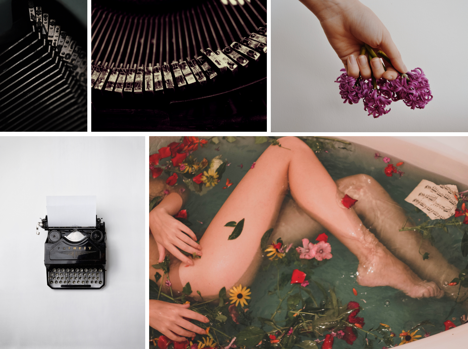
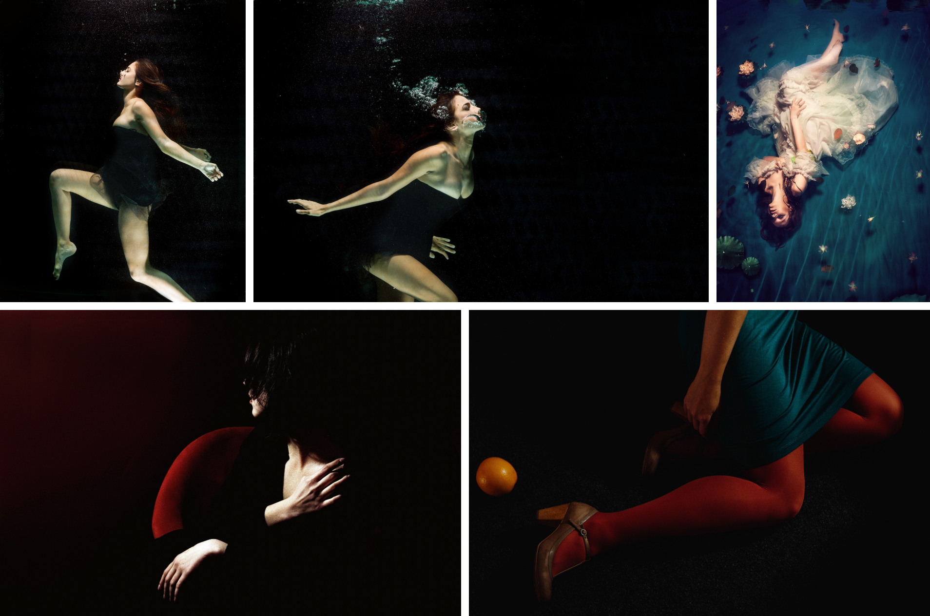
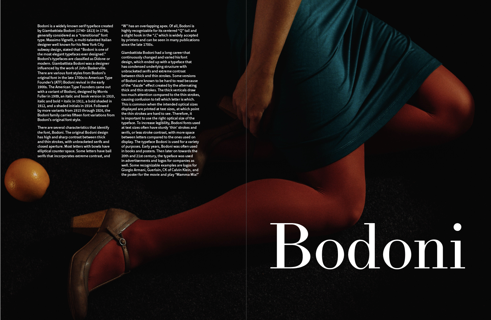
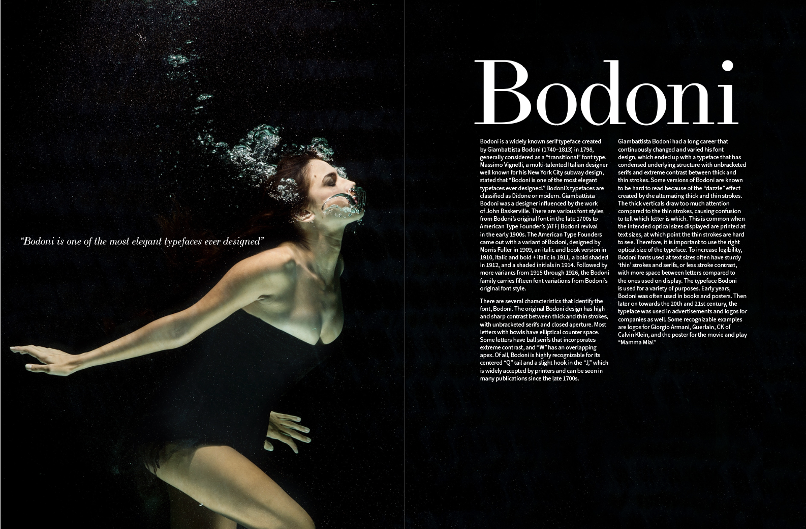
My first impression of Bodoni was elegance. Later I started listing adjectives that best describe the typeface, which was used to help find related images for the magazine spread. The key words I emphasized in searching for images were: classic, elegant, modern, clean, fine, and luxurious. I wanted to depict the elegance Bodoni has in its structure and characteristics.

Layout Exploration
I began lay-outing title and texts with the images to select the final iteration that I will further refine.
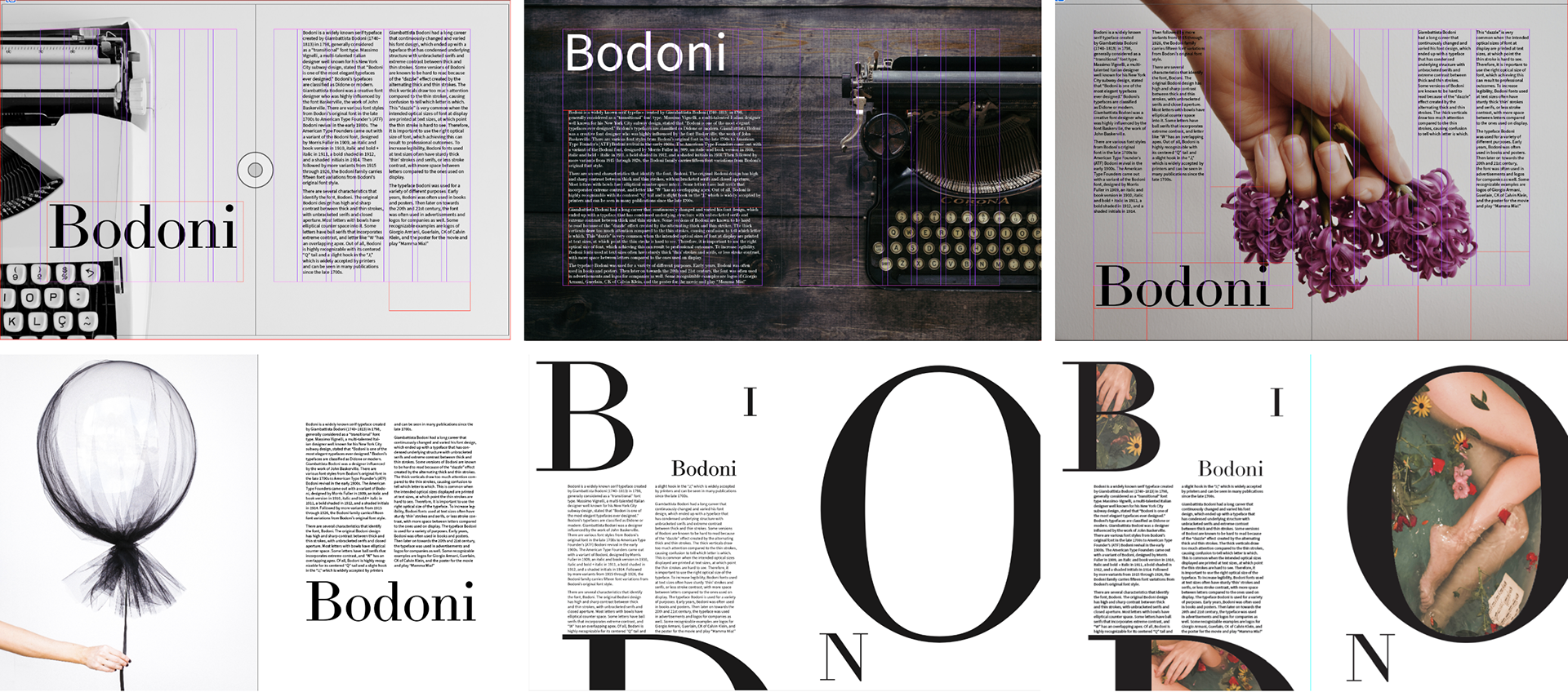
Selected Layout
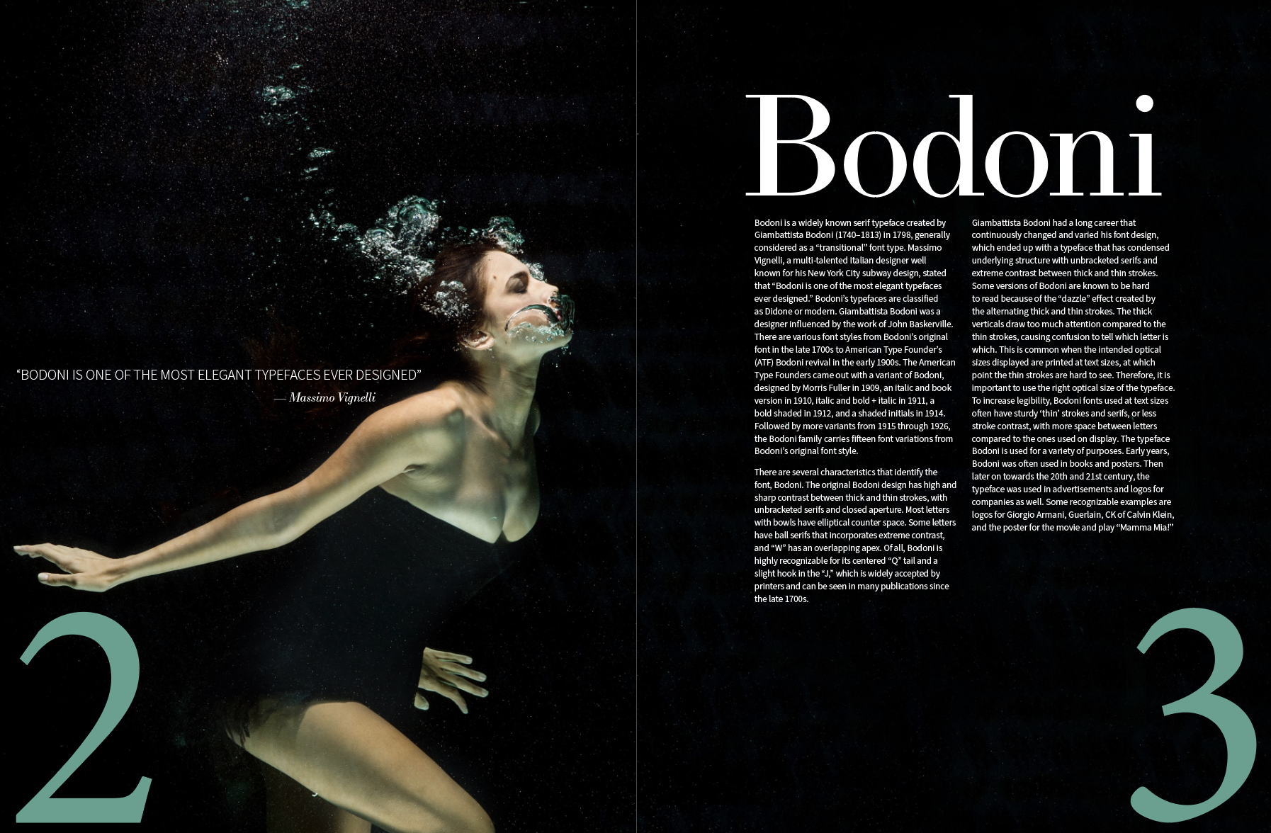
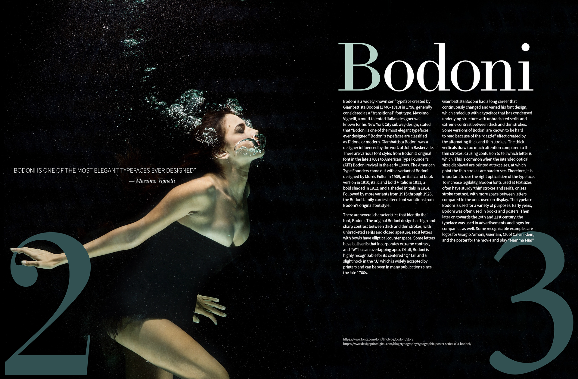
The intent of this layout is to make the audience view the spread in a flow. The woman is tilting her head towards the word Bodoni, allowing the audience to think that she is looking at the title. This particular layout will allow the eye to follow the angle of the face towards the title and down to the body texts in the spread.
Selected Layout for Spread
Refinement
I enlarged the page number to overlap with the woman’s fingertips and allow the audience to first grab their attention to the far left of the spread. This enables the viewer's eye to start from the hand to the head of the woman, which the angle of her face will lead the eye to follow the title and down to the body texts. The overlapping body texts and the number ‘3’ allows the audience to pull their eye down along the page number and finish with the citations at the very bottom. Because the large-sized page numbers are overwhelming, I toned down the color to reorganize the hierarchy of the page.
Spread Iterations
Spread Iterations
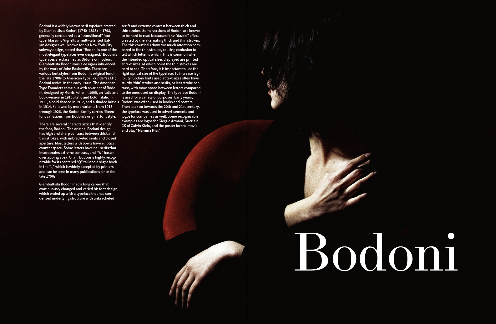
Final Spread
After making continuous minor changes, I ended up with this final magazine spread.

Final Magazine Spread
Motion Graphics Animation
Pushing the exploration of Bodoni further, the next sequence to this project is a motion graphic animation that talks about the typeface.
Music
Bodoni is elegant, yet the heavy contrast between the thin and thick strokes make the typeface dynamic. Therefore, I searched for a music that defines both elegance and dynamic at the same time. I chose a song called “Eager” by Def Startz, which had a modernistic and elegant vibe with a dynamic beat to the background. Using Garageband, I edited the four minute song into a one minute short music.
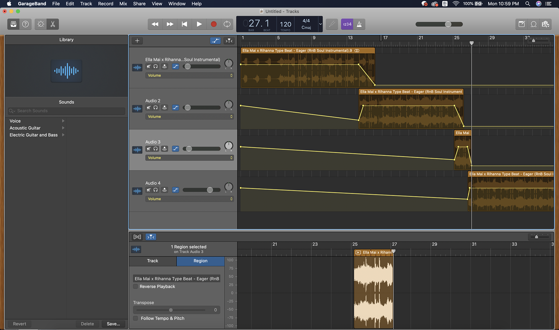
Editing Music
Brainstorming
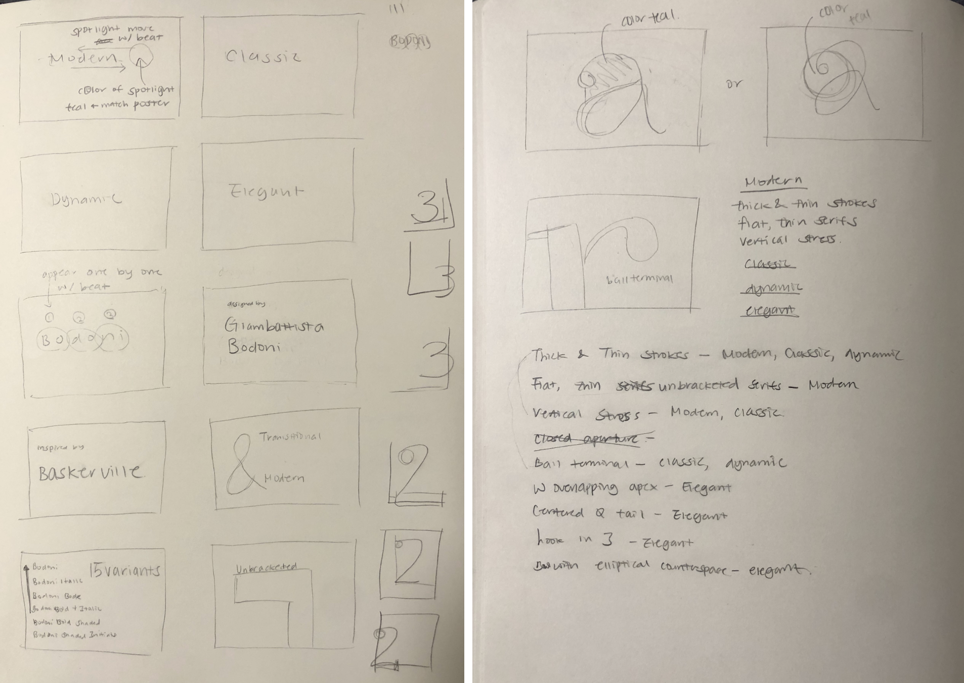
I started off by listing what I want to mention in my video. My main arguments are that Bodoni is Modern, Classic, Elegant, and Dynamic. Then, I briefly sketched what my video layout would look like for each frame. Although it is not perfect, I was able to organize my thoughts through these sketches and utilize them for further process.
Storyboard
I created the sketches into digital storyboard layouts. My goal for this step was to block out the structure and positioning for the animation. Using the same colors used from previous magazine spread, I intended to create unity between the two works of this project.


Final Motion Graphics Video
The motion graphics animation was built with aftereffects. By continuously receiving feedback from peers and mentors about their experience with the animation, I constantly applied minor edits to the video.
Final Motion Graphics Video
Programs Used
Adobe InDesign, Adobe Photoshop, Adobe Illustrator, Adobe AfterEffects