Overview
Learning everything about James Dyson, an industrial designer and founder of Dyson Ltd. Inspired by his products, this project explores variety of colors, layouts, and typesettings.
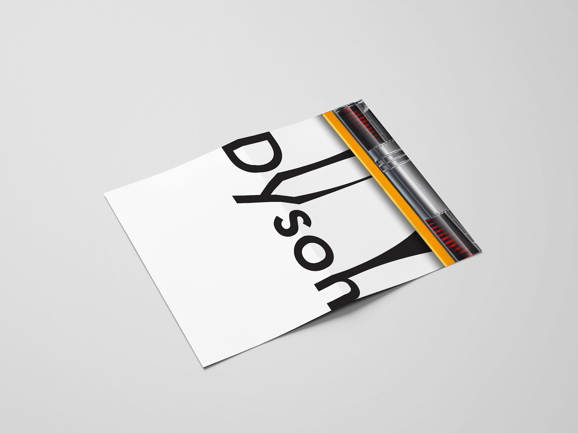
19.25X31.75" Informational Poster
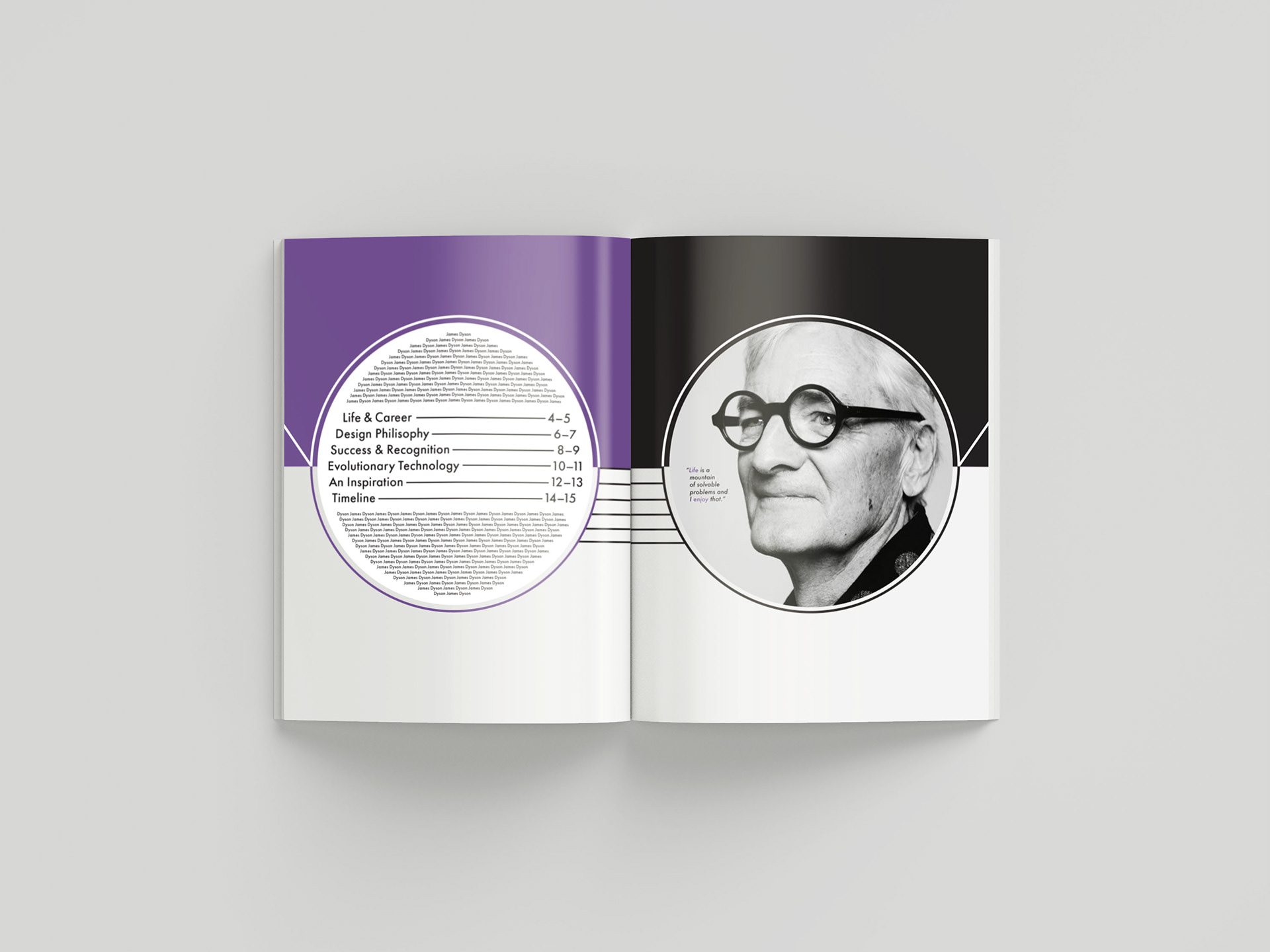
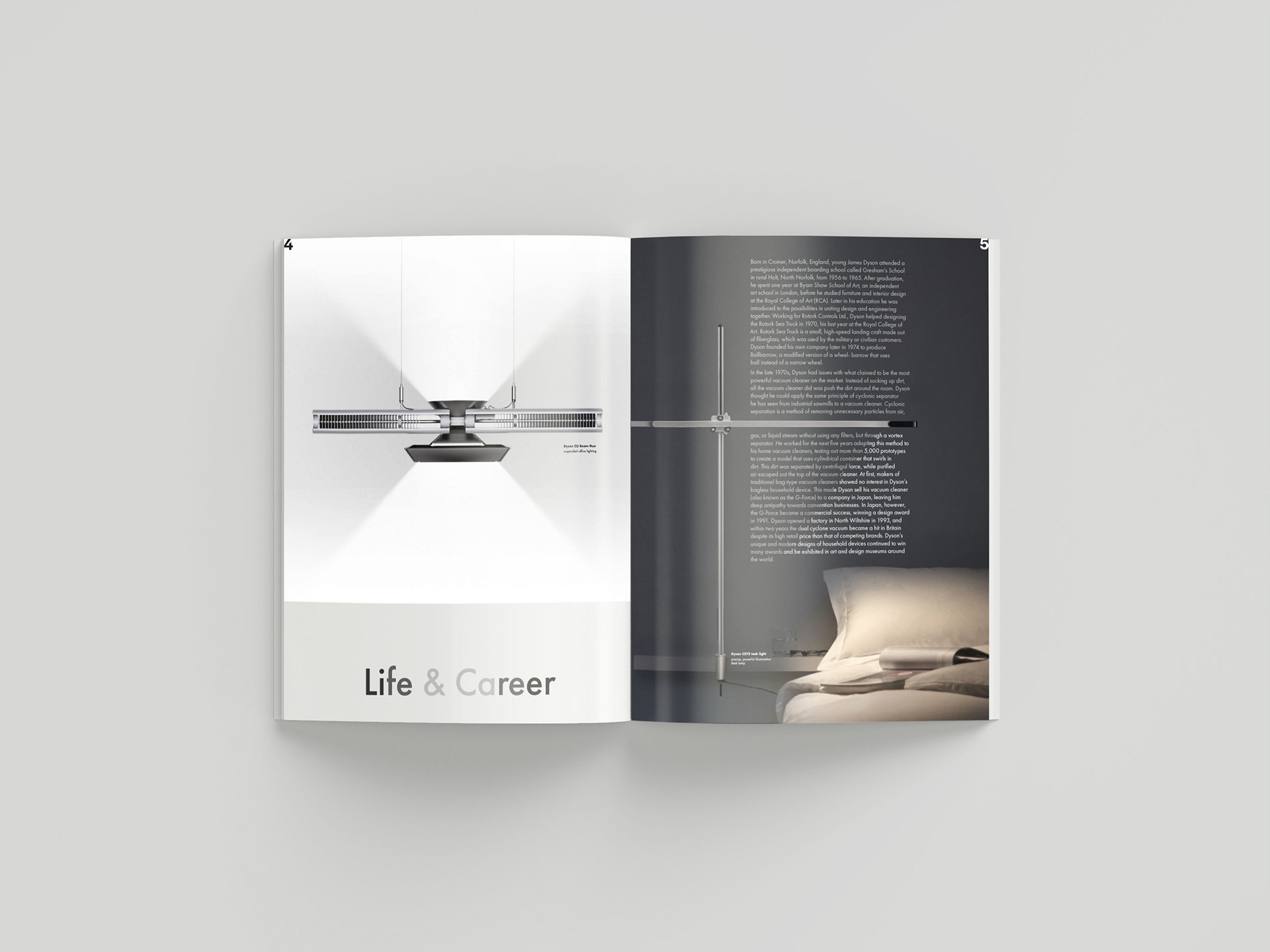
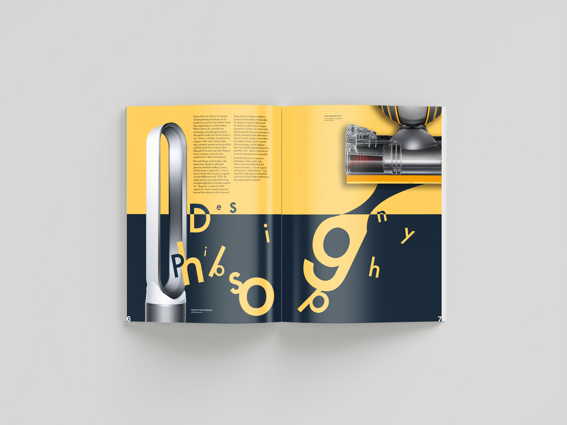
8.25X10.5" 16 page booklet
Contributors: Individual Project
Duration: 7 weeks
Poster Design

19.25X31.75" Informational Poster
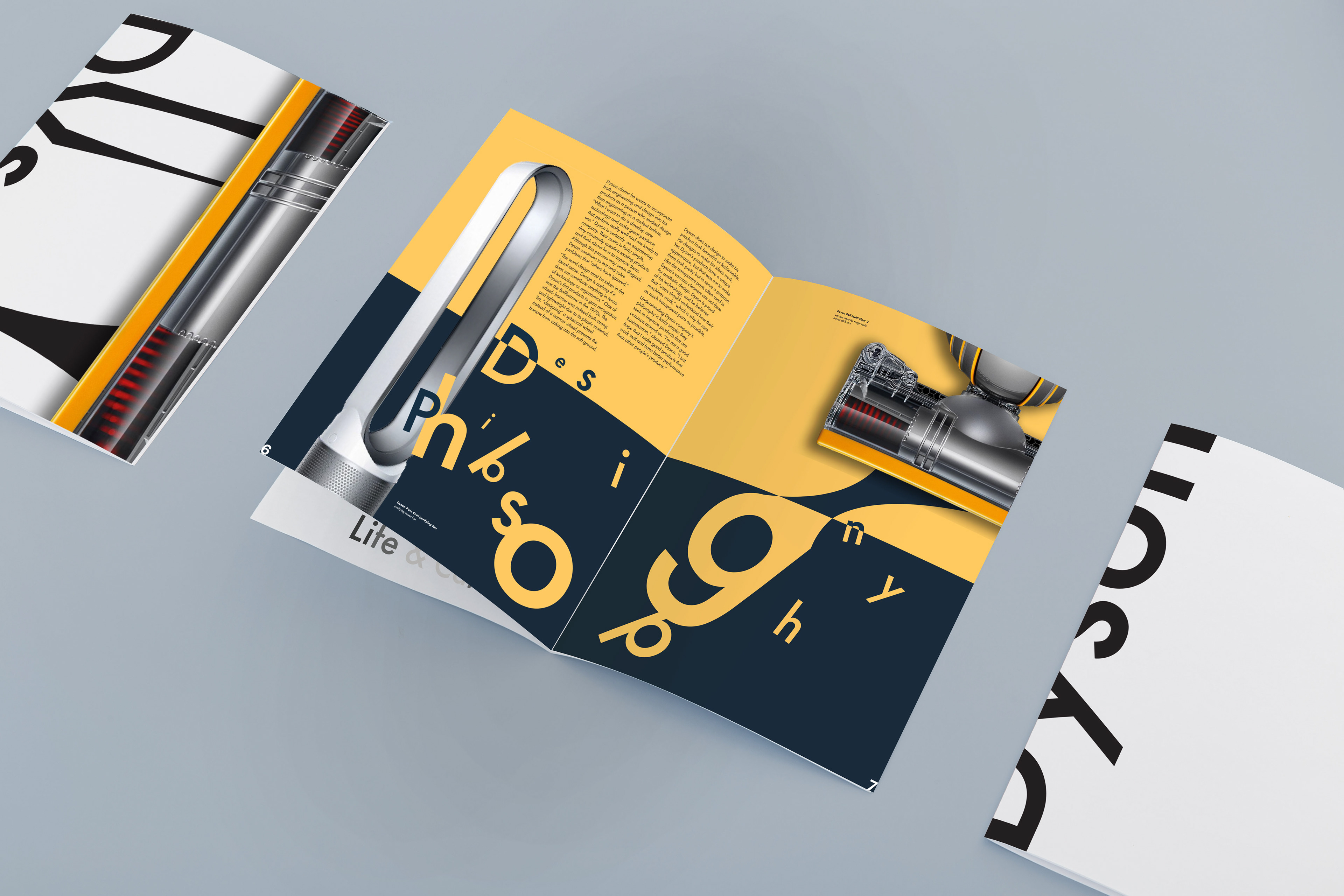
Booklet Design

Sketching Layouts
Starting off with creating sketches for the poster’s layout, I tried to explore the best way to incorporate images of Dyson products along with other informational elements in the poster. Trying to utilize the basic shapes most Dyson products are structured, I intended to plan a variety of layouts that helps visualize the designer.
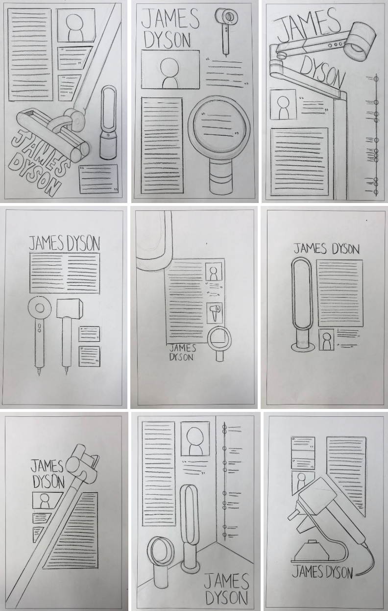
Sketches for Layout
Kits of Parts
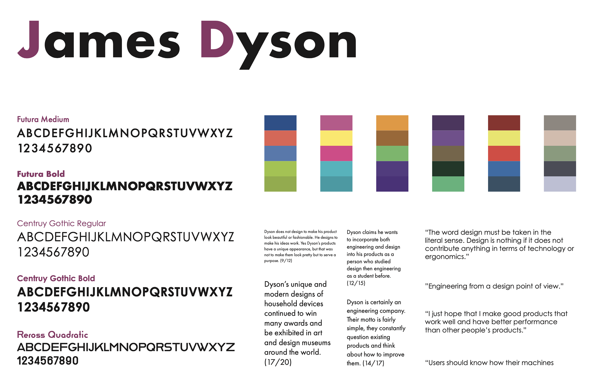
The goal for the kit of parts is to discover the matching typeface, color palettes, and typesetting for the poster. In search for a font similar to the one Dyson uses for his company’s logo, my aim was to find a non serif typeface that has a nice round smooth structure. I ended up with Futura, Century Gothic, and Reross Quadratic.
Most of Dyson products are designed in a specific shade of purple, pink, yellow, red, blue, and grey. Utilizing those colors, I created a series of color palettes that go well with each other.
Mood Board
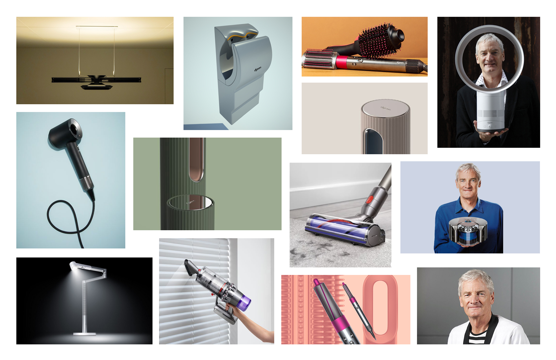
In searching for product designs on the internet for the mood board, I realized that the background color often matches with the color of the product. The main takeaway from this research is that the matching colors emphasize the color and its unity. Inspired by my mood board, I thought of matching the colors of the background and the image of a Dyson product for the poster.
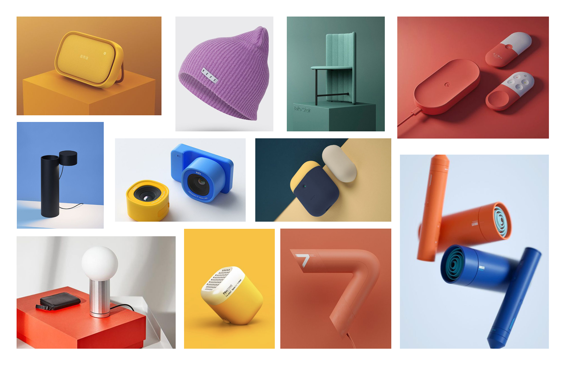
Mood Board
Samples and Refinement
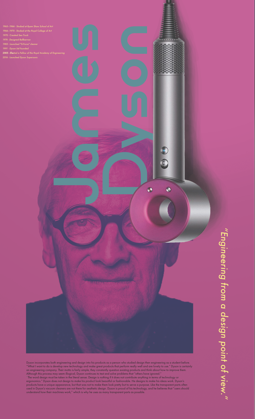
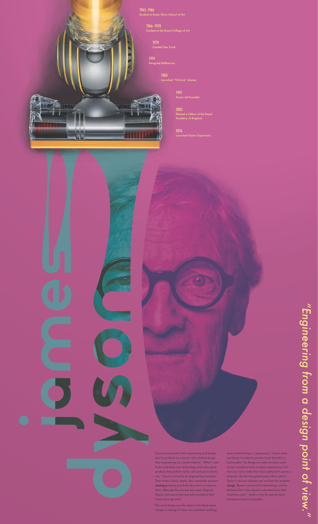
Utilizing the vivid color palettes from the Kit of Parts, I digitized two posters from my previous sketches. After talking with peers and mentors about their experience with the posters, I learned people enjoy the pink and blue color palette better than the other. Yet the interaction between the vacuum and the name of James Dyson was more appealing, which helped me come up with a decision to incorporate the ideas of two posters together. I also realized that both posters have stiff shapes and texts, which is what I focused on to change in my next prototype.
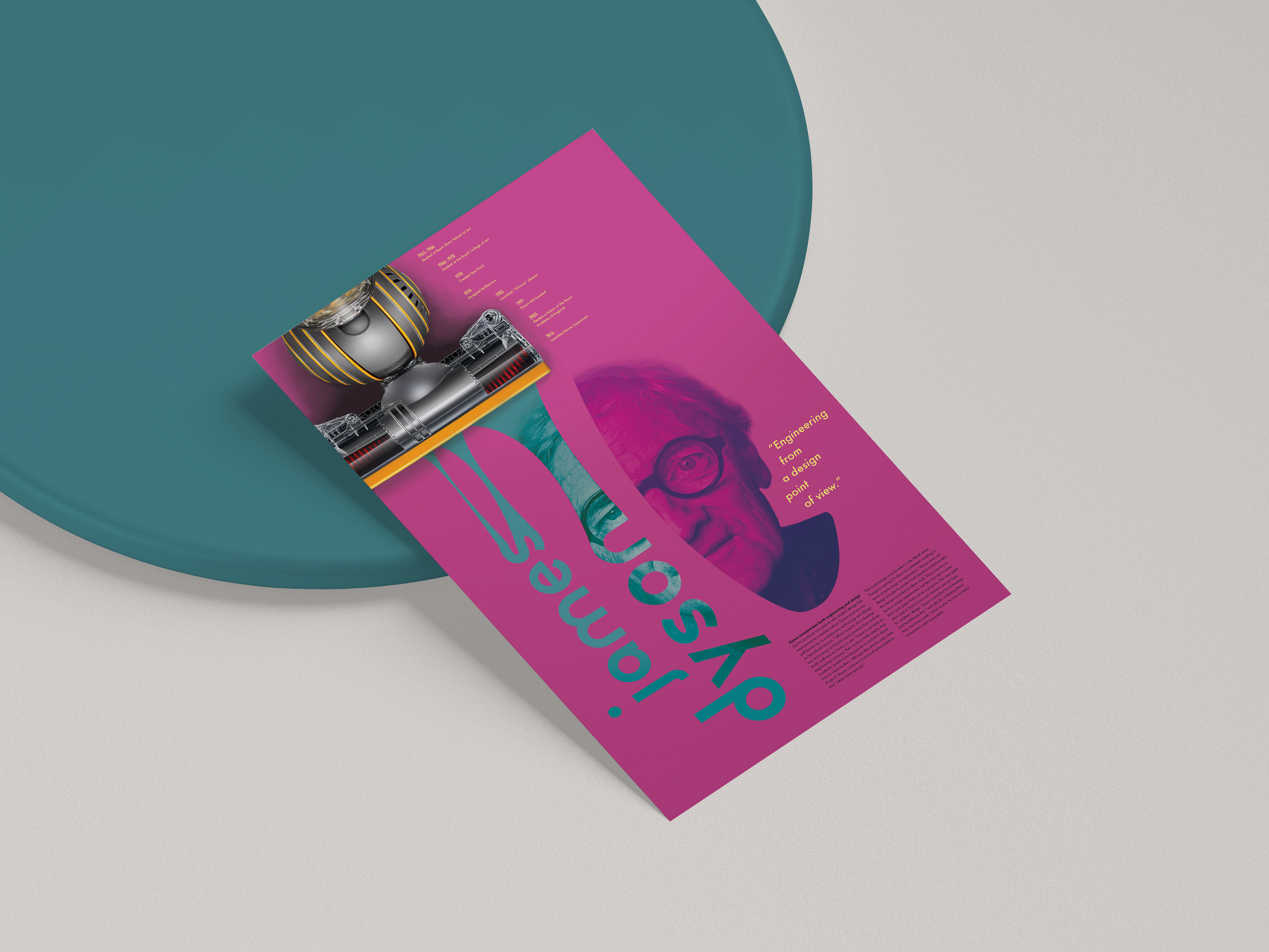
Constructing Final Poster
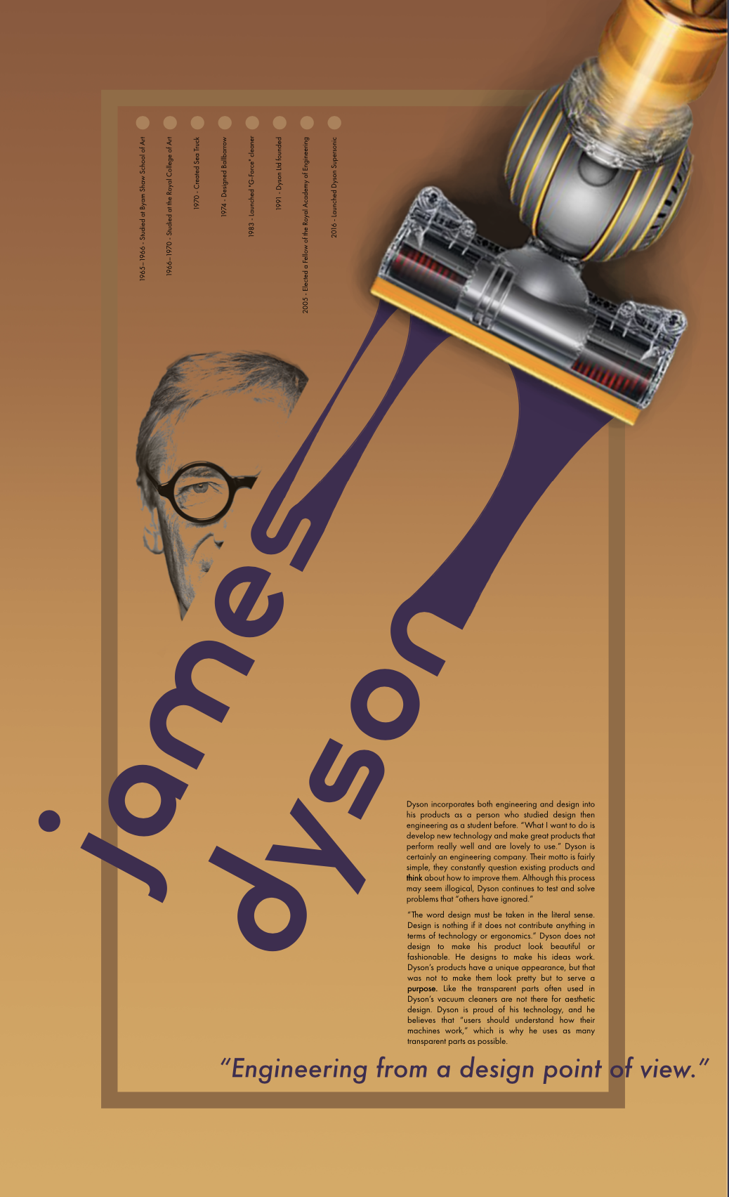
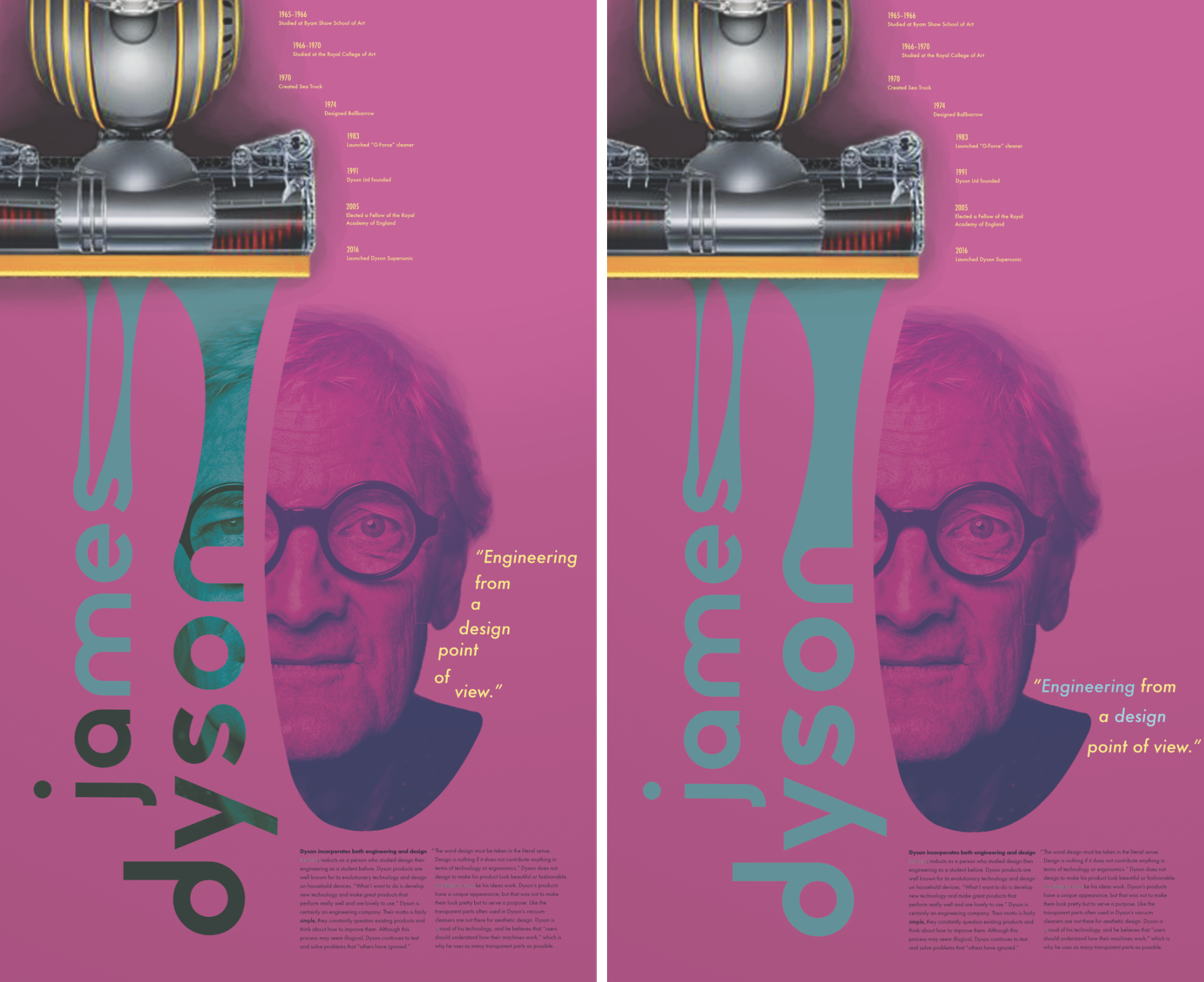
With feedback I received from peers and mentors, I created multiple iterations to finalize my poster. I enlarged the image of the vacuum so that it bleeds out of the frame, explored colors of the text for ‘James Dyson,’ placed the quote in different layouts, and shaped the portrait with different crops. Overall, I was able to learn the significance of unity as a whole and how different elements can get along with another through constant exploration and modification.
Final Poster
From colors to text layouts and image selection, I constantly made changes to the poster to come up with a final design.
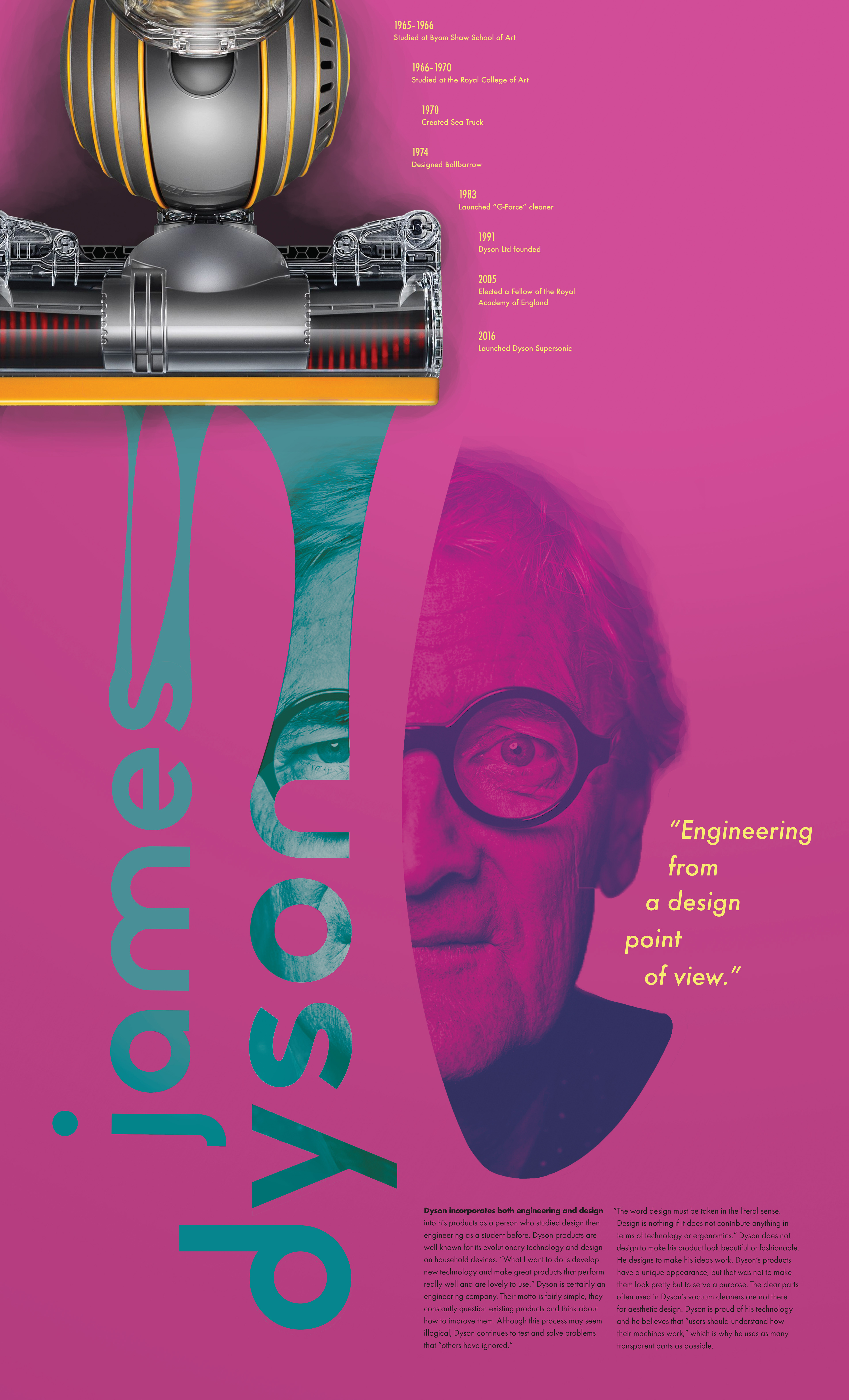
Final Informational Poster
Programs Used
Adobe Photoshop, Adobe Indesign, Adobe Illustrator, Adobe After Effects, Adobe XD, HTML/CSS